EPIC.png

This Is Epic

A curation of our design ideas and inspirations for houses in Goa, contemporary art and architecture.


Posts in Architecture
Renzo Piano on buildings and architecture

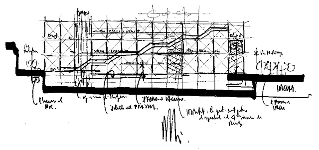
Initial Sketch, Pompidou Center, 1971-78, Piano & Rogers (Source: www.phaidon.com)

Renzo Piano is the architect of hands-down my most favorite building in Paris, the George Pompidou Center (sorry Mr. Nouvel, I love your buildings too..).

Watch the video below as he describes what architecture means to him. Truly inspiring when he says, 'architecture is the way to answer practical needs; but architecture is only architecture when it answers to all sorts of desires.' Also that architecture can change the world. And further in the interview, that the inspiring element of 21st century will be energy and sustainability... and that sustainability should be looked at as a new and positive opportunity for buildings and young professionals.

Click on

link to watch Video Part I and II

, courtesy archdaily.com

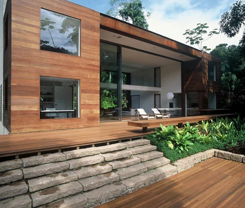
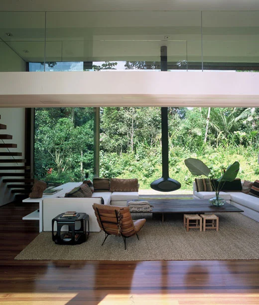
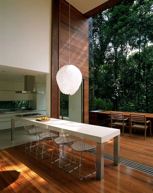
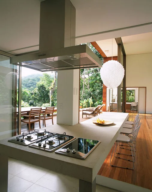
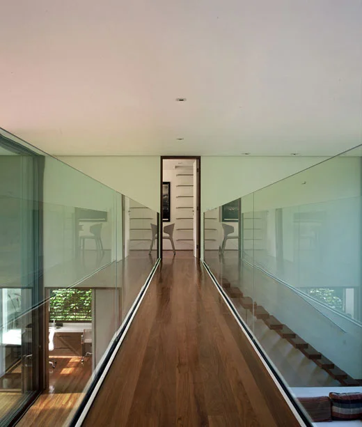
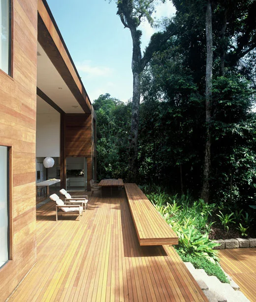
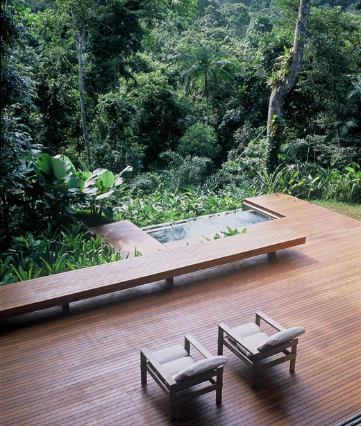
House in Iporanga: Another Brazilian Knockout

This house is called “

House in Iporanga

” located at Iporanga, Brazil just outside of Sao Paolo. This beauty is designed by Studio 

Arther Casas

 as the architect's own residence.

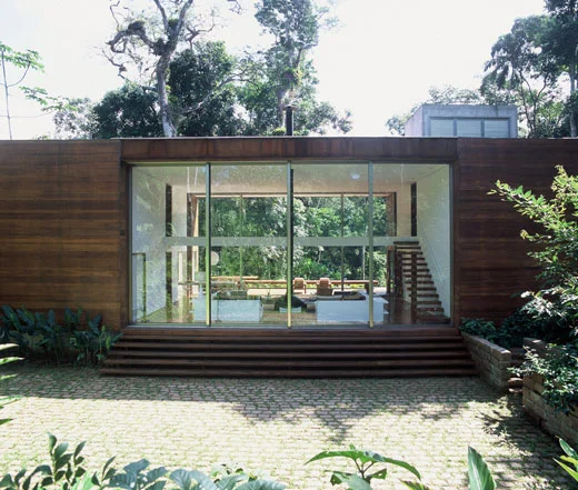
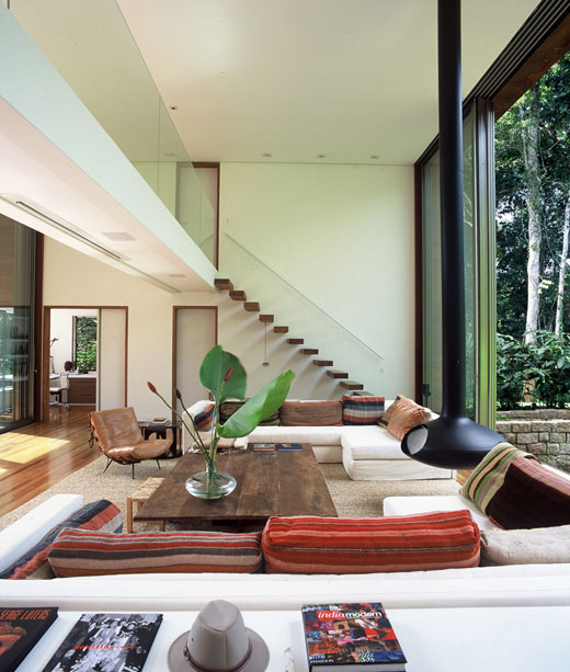
We love love love this house. Once again the openness of the living room is something that resonates closely with our design concept for Nivim. The double height adds to that openness along with openable front and back glass walls that connect with the tropical forest surrounding the house. the architect envisioned this house to be a place to recharge his energies and be close to forest.

In the exteriors, the simple clean lines along with the use of wood and glass presents a building that embodies the tropical contemporary building style.

The interiors are kept minimal to keep the focus on the powerful space and the forest outside. Just looking at the pictures makes me feel calmer, I am sure being in the space would so much more serene and enlightening... Enjoy more lovely photos below and keep in mind that we are striving to achieve a similar impact with the living room space at Nivim ! (Photos of our space coming soon)

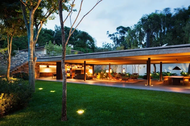
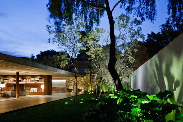
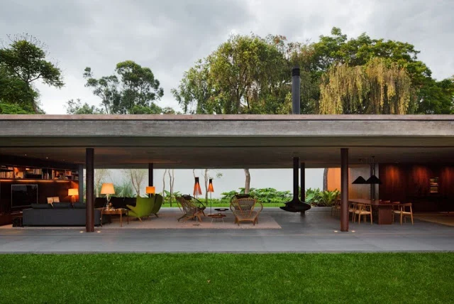
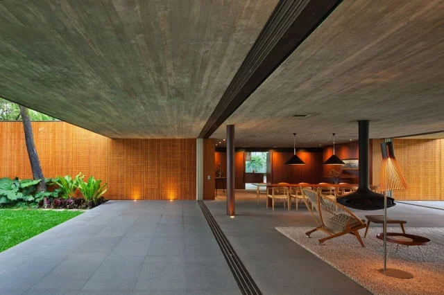
Contemporary V4 House in Brazil

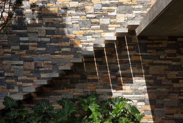
Rustic stone combined with minimal staircase at V4 House, Brazil

I am consistently amazed and inspired by the contemporary residential architecture emerging from Brazil. For the longest time the rage was contemporary homes in Bali and the new Asian Tropical architecture … and now, more and more I am finding that homes in Brazil (also a tropical country with similar weather patterns as Goa; and as a side note, both former Portuguese colonies), is offering some stunning examples of contemporary architecture that are inspiring while we build Nivim.

The following are pictures of the V4 House in San Paulo, Brazil published in

Archdaily on August 13, 2012. 

The most interesting aspect of this house is the living room, where doors on both sides of the living room completely retract to allow for the integration of the front garden, living room and back patio… wassaa…sounds familiar… yep, this has been the concept for our living room space too with two long walls fitted with sliding doors that open up to make the living room one space with the front and back courtyards. You can re-visit it on our previous blog post, '

Dreaming up a life lived outdoors

'.

We love the clean lines, the natural flow of space, minimal furniture and integration with rustic materials. Enjoy the images of the spectacular living space at V4 House below, all courtesy Archdaily.

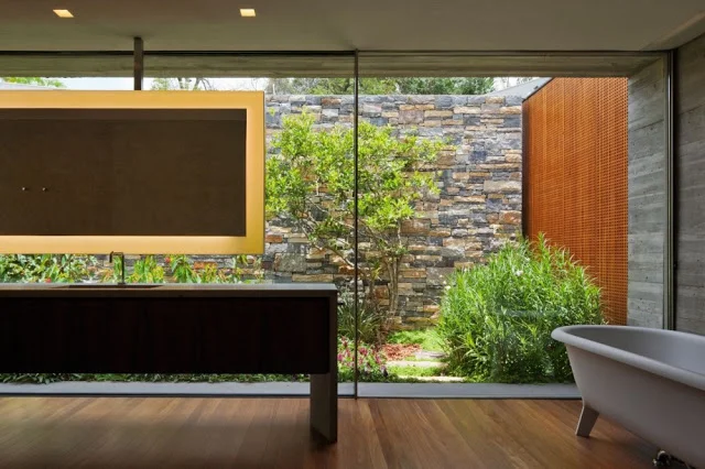
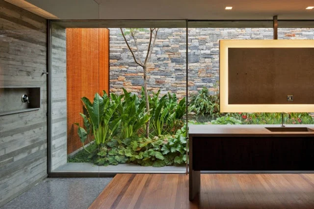
Then there is this bathroom at the V4 house (below), truly inspiring... I am happy to say that we have 4 such bathrooms at Nivim. Each bathroom designed with its own courtyard and seamless connection to the outdoors.

The Sublime Reis Magos Fort in Goa

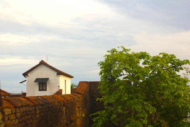
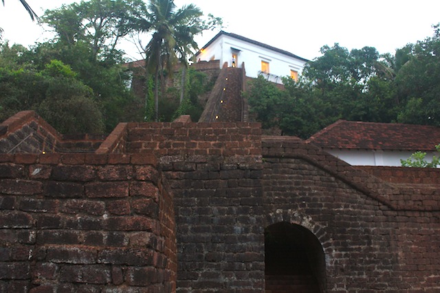
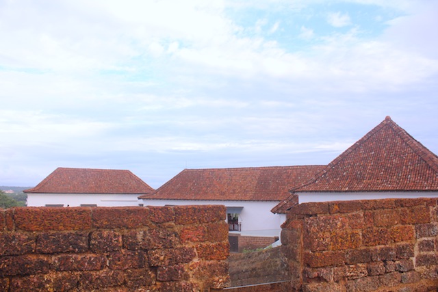
Last week the beautifully restored Reis Magos Fort was opened for public. Below are some pictures. The highlights are the fort's pristine condition post-restoration, its siting and views. I love the feel and texture of laterite stone with whitewashed walls, clay tile roofs and wild greenery, all aspects that I believe are so quintessential to Goa.

The fort is located on a hill and accessed through a ramp and two narrow staircases, all executed in beautiful laterite masonry. Laterite is the local stone and most common building material used in Goa.

I write this post while hoping that we can continue to maintain this treasure and not let it once again fall into disrepair and neglect.

Country tile roofs of the building inside the fort walls

Gorgeous earthy central courtyard

View of Reis Magos church and cemetary from the highest point of the fort 

View of the river Mandovi from the fort

Narrow stairs leading to the fort will beautiful terraces below

Fort wall with lookout station

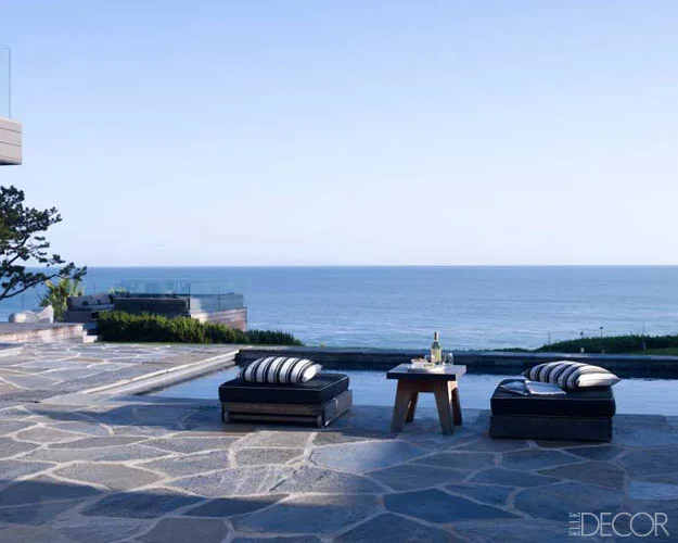
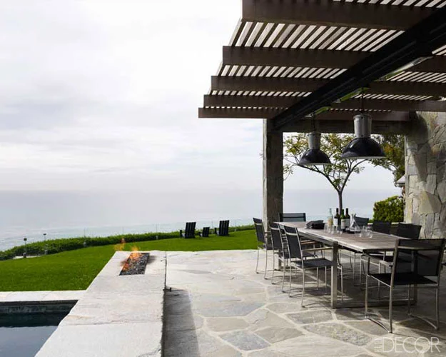
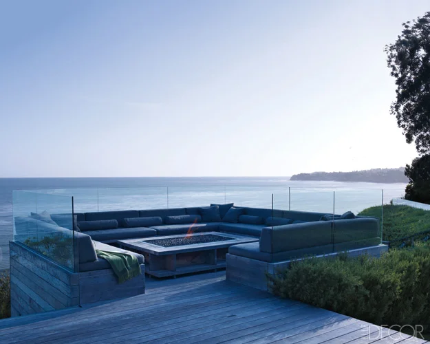
The Malibu home of Courtney Cox

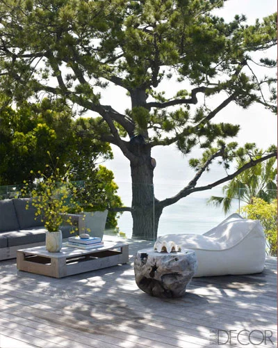
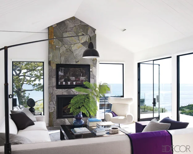
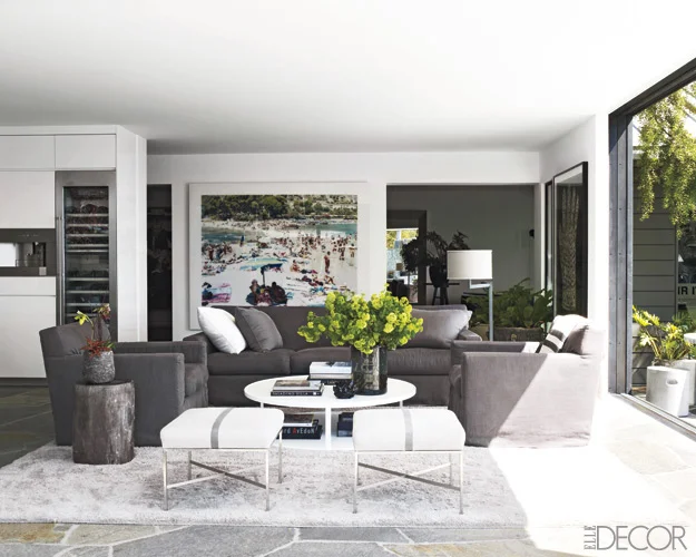
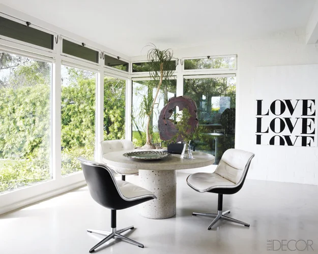
I am not the type to be much into celebrity homes... but this one caught my eye primarily because its theme is so similar to our own at NIVIM Goa. The house is designed to connect the indoors with the outdoors and provide a peaceful space to escape, inspire and celebrate with family and friends.

Courtney Cox's home was the cover feature in Elle Decor, US Edition, July/ August 2011. All photo are courtesy of Elle Decor Online. See link.

The house is located in Malibu. One of the architects for the house says that 'Malibu is all about being outdoors'. Exactly the same in Goa...

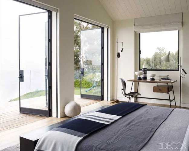
The article talks about how the house looks out over the deck and pool and beyond. The architects designed the spaces with a sense of openness with glass walls that flood the rooms with light. The glass doors, once opened, makes one feel like they are completely outside. 

The result is a space that is chic and unquestionably luxurious, yet earthy, cozy and unpretentious... Its interiors were kept neutral and bare that keeps the focus on the outdoors. 

Sounds familiar doesn't it !! Read about our efforts to design NIVIM to seamlessly connect the indoors with outdoors. See link

It is not a surprise that the concepts in the house above and our efforts are so similar. In my mind, there is a distinct vocabulary for building in the country. It stems from the underlying reason for people to choose to live in the country, clearly to 'reconnect with nature'. And with that concept in mind, the architecture has to be as much about the outdoors as indoor, if not more. We are loving our journey to give NIVIM its special character built around its site and surroundings. The house as a result is shaping up to be quite fabulous and heart warming. I promise updated pictures soon.

Living area adjacent to the kitchen

Sit-out with large glass walls

Master bedroom that becomes a part of its deck and views beyond

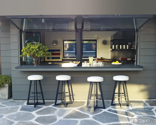
Outdoor bar and galley kitchen

Earthy bathrooms

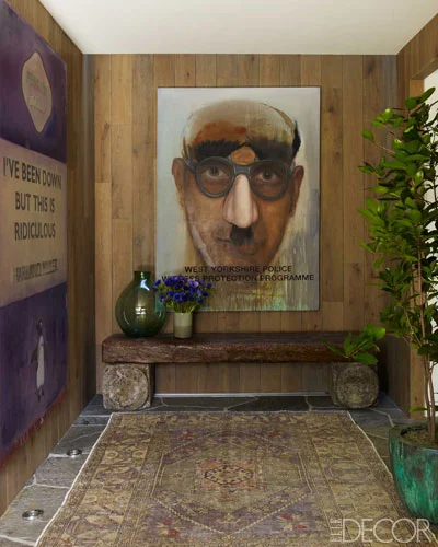
The entrance alcove dictates the the earthy and natural style of the house

The pool and deck looking over to the sea

Outdoor dining

Undeniably the most precious space in the house, a pavilion set into the scenery with seating around a fireplace. As per the article, Courtney Cox has her coffee here everyday...I can see why !

Part II: Architecture Inspiration from Past NY Trip

After food, fashion and art, finally I move on to architecture, clearly my favorite indulgence...During my short last visit to New York, I had the opportunity to hear two great architects talk about their work in the recent years, Enrique Norten from Ten Arquitectos and Charles Renfro from Diller Scofidio + Renfro.

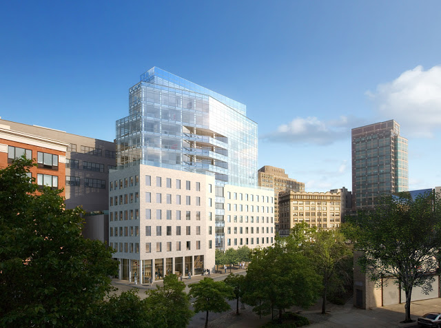
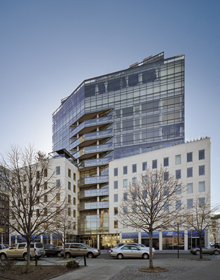
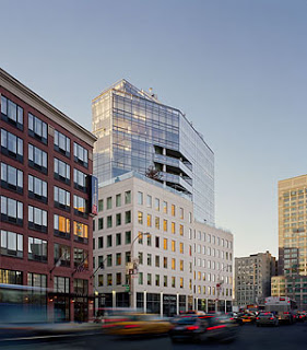
Images of One York Street in New York designed by Enrique Norten

Enrique Norten is a Mexican architect with several design awards under his belt. I have always admired his building - One York Street in TriBeCa in New York (We have at one point seriously considered living in it too !!). The building incorporates and rises out of two 19th Century industrial loft buildings. I love the way the new building has a distinct identity but did not demolish the old buildings or start from scratch to achieve that distinction. The building while preserving the old, still manages to look extremely contemporary and modern. One York is located at a busy street intersection and in between 3-4 neighborhoods. The building does a great job of providing a fitting landmark at this junction without being gimmicky. It is just a piece of very good and slick architecture.

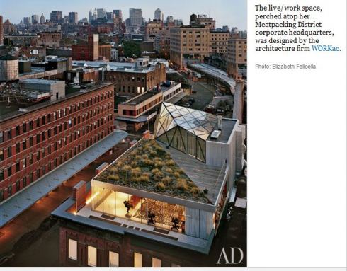
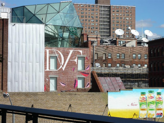
We have spoken about Diller Scofidio + Renfro on this blog before as they are the visionary designers of the magnificent High Line. As a side note, Diane von Furstenburg who we spoke of earlier (Part I of this series of posts) is one of the largest benefactors of the High Line project and occupies a sexy building right next to the rail line. (Read about it

 here 

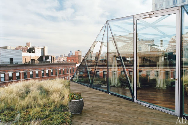
). It is an old warehouse with a contemporary steel and glass addition on the top. This rooftop addition houses DVF's bedroom. The funky building has a quirky mural on a 3-storey high side wall (a clever piece of branding, I say) and is also lit up in multicolors after-dark.

DVF's live-work loft with the rooftop glass addition along the High Line in NY (

Photo Credit

)

Rooftop addition at DVF's live-work warehouse along the High Line in NY 

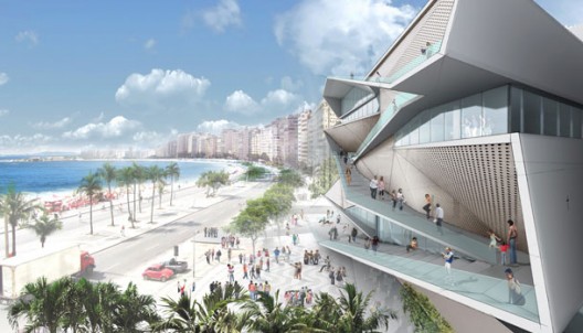
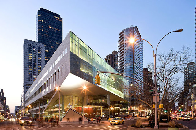
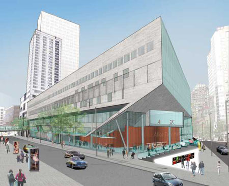
Charles Renfro spoke about the firm's constant effort to integrate public space into their buildings. Examples include the new Institute of Contemporary Art in Boston, where they integrated the public harborwalk into the building by carving out a public amphitheater space at the ground level of the building; the Image and Audio Museum in Rio de Janeiro in Brazil where they have designed the front elevation as a public ramp-way that takes people up to the building allowing a user to look into the building, its exhibits and activities; and the addition to the Alice Tully Hall at Lincoln Center in New York, where they sliced the building to create a public amphitheater seating while exposing the studio spaces providing a barrier free view from the street, once again making the public a part of the building and its activities and vic-a-versa.

Very inspirational out-of-the-box thinking... I love them for slicing and dicing the buildings while dissecting the conventional concept and perception of particular building. Admire them for their ability to step back from the obvious and give each building a new identity. Applaud them blurring the lines between private and public; and making buildings open up to the city.

The Institute of Contemporary Art in Boston by Diller Scofidio + Renfro (

Photo Credit

)

The proposed Image and Audio Museum at Rio de Janiero, Brazil (

Photo Credit

)

The proposed Image and Audio Museum at Rio de Janiero, Brazil (

Photo Credit

)

Alice Tully Hall at Lincoln Center in New York (

Photo Credit

)

NatGeo Interview on Green Buildings in India

I was recently interviewed by National Geographic for their upcoming documentary on Green Buildings in India. The following was my response to them and it lists my views in a nutshell on the topic. I hope I do not sound too angry, disappointed or disgruntled... the truth of the matter is that we have a long way to go to make green buildings as mainstream commercial and day-to-day construction practice in India today.

_________________________________________________________

Dear Mr. Producer

Thank you for your email. I am an IGBC accredited professional in India and a LEED accredited professional in the US. I am architect and have been working in the design and construction industry in New York for many years.

For the last year and a half, I have been busy in building the first green certified home in Goa. We are aiming for the Gold IGBC Green Homes certification. What makes the project unique is that we have considered and employed strategies from the three green ideologies that exist in India today:

-

The age old traditional common sense building principles such as building orientation, retaining existing trees and building around them, courtyard plan, load bearing walls, etc.

-

The alternative building strategies such as filler slabs, reducing use of cement, prioritizing use of existing material on-site, recycle and reuse of wastewater, etc.

-

The new cutting edge technologies such as solar water heater, environment-friendly HVAC systems, moisture sensors, electric sensors, electric vehicles, low VOC paints, green roof, etc.

Unfortunately in India today these three streams of sustainability exist in individual silos and are not really working together. Everyone seems to be doing their own thing while commercial developers have joined the green building bandwagon only as eyewash to improve marketability and sales

The biggest challenges to green buildings in India are the vast regional climatic variations, perceived high cost, lack of usable information, material procurement, labor training, lax regulatory environment, lack of incentives and lack of education on the need for green building among contractors, building material manufacturers, vendors and the final consumers.

Organizations such as IGBC, TERI and CSE have done a good job of educating and training the architecture community. There is also awareness among the global material manufacturers and suppliers. But sadly, there is still long way to go when it comes to training the remaining regional/ local participants of the construction industry. It would actually be fun if you walk through a local building materials market in your city and simply ask the vendors and buyers ‘what is green building’. This could result in an amusing montage on the state of green building in India and how far we still have to go.

We are building in a small state of Goa and have faced challenges in procuring items as simple as low-flow water fixtures. We are now accustomed to receiving blank stares from vendors, public officials and neighboring community at the mention of the word ‘Green Building’. An interesting anecdote is my conversation with my neighbor who was shocked at our plan to construct recharge pits to percolate rain water back into the earth. Her state of utter shock (and some extent distrust) stemmed from the fact that she could not comprehend why we would spend money on something that did not give us anything back. When I explained that sometimes actions need to be based on the larger common good and not only immediate personal gain, I was honored with the same blank stare…

It is surprising that in a state with a high percentage green cover, a rich agrarian culture, low population and density, the residents frequently complain about lack of adequate water supply. Goa is a coastal state and receives a very high amount of 3metres in rainfall every year. Still the water table around our site has been dropping over the years. The same neighbor as above attempted to dig a well in their property many years back and did not find water at decent depth. The obvious problem is that we are using resources at a much faster pace than the earth can replenish. This problem is of course much more pressing in cities but it is a shame when you find it in the seemingly green paradise of Goa. As with the rest of India, Goa is experiencing a building boom. The responsibility of builders to preserve this fragile remaining slice of extremely biodiverse and sensitive environment is extremely critical.

Green building is responsible building. Among global consumption of resources, buildings account for: 20% of water use; 25-40% of energy use; 30-40% of solid waste generation; 30-40% GHG emissions; and 40% of use of raw materials. While building anything, even a tiny house, one must understand that we are utilizing material, energy and water in construction, and changing the ecology of the site and surroundings forever. Plus, we are adding to the demand for resources for as long as the life of the building.

Another favorite statistic that should be a wake-up call to the current mainstream building practices in India is that the production of Portland cement accounts for 5 - 8% of global greenhouse gas (GHG) emissions, the major cause of climate change. The high emissions are due to the chemical process that produces cement and as a by-product generates large amounts of carbon dioxide. One ton of GHG is released with every one ton of cement production. These figures are shocking and must be considered while thoughtless construction of concrete frame-structure building and hardscaping of open areas.

I have added brief notes to your questionnaire. Your show can go a long way in educating the common man about the need and benefits of building green. I hope that you will attempt to dig deep into the subject. I wish you best for your project.

I am adding some biographical information about myself below. For more information on our project in Goa, you can visit:

http://www.newyorkgoadiaries.com/

http://www.newyorkgoadiaries.com/search/label/Green%20Building

Best

Anjali

Record Houses that bring the indoors outdoors...

The Bahia House, Salvador, Brazil designed by Studio MK27 

A

rchitectural Record

, 'the' premier global magazine for architecture and design publishes a selection of homes each year that make the cut. In their selection, the magazine looks for innovation in design along with timelessness in architectural response. While these may sound like seemingly contradictory principles, I guess the ability to be both innovative while being timeless makes an architectural product truly inspiring. Among other factors, the 2011 selection highlighted the responsiveness of the architectural projects to their surrounding landscape. This principle has been the central theme in our design process and thus this year's project selection was of particular interest to us.

Two projects in particular caught our eye. Both are contemporary country homes and share many design principles and concepts that we are using for our house NIVIM in Goa. The interesting aspect is that both houses are built in completely different materials and technology but utilize the same principles of responsiveness to site and relationship to outdoors.

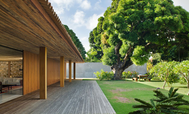
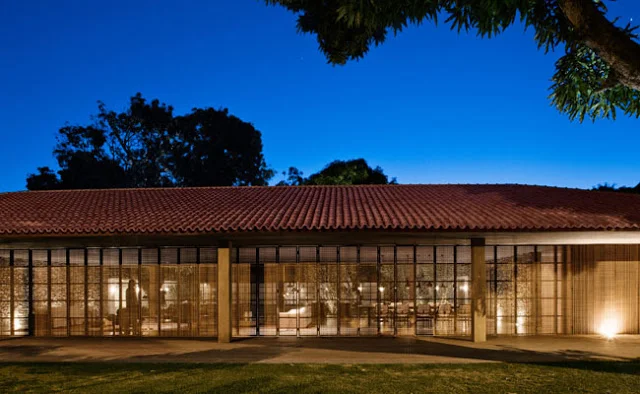
The Bahia House, Salvador, Brazil designed by Studio MK27 

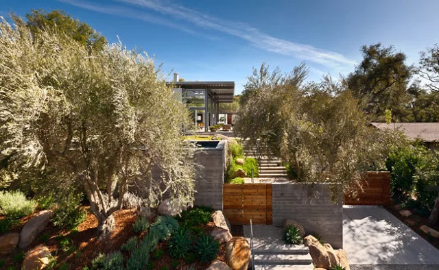
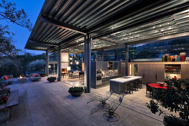
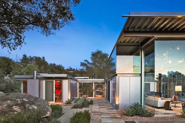
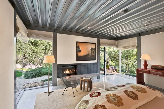
The Montecito Residence, Montecito, California designed by Barton Myers Associates

First is the

Bahia House in Salvador, Brazil

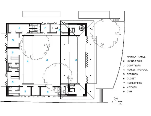
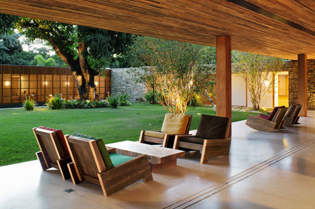
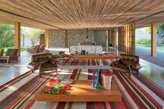
built in clean modernist geometry using earthy vernacular materials stone, wood and clay tile. This house is set around a courtyard and the living spaces are designed to become a part of the surrounding landscape. The living room is designed with sliding double walls, one with screens and another with glass. When both are opened, the living room becomes a part of the surrounding landscape. The screen walls provide privacy but allows air circulation. (All images courtesy 

Architectural Record

)

Floorplan shows the living room shown as "2" being an unobstructed space between the landscape

The living room space is designed to be a part of the surrounding landscape with double walls that slide our of the way. (Note the Rajasthani puppets on the coffee table !)

The second house that I have picked is very different in its language (materials, technology, look and feel) but its purpose still remains the same. The house is the

Montecito Residense in California

, designed by Barton Myers Associates. This house is a glass and steel structure that is designed 'to embrace the garden and not shutter it out'.

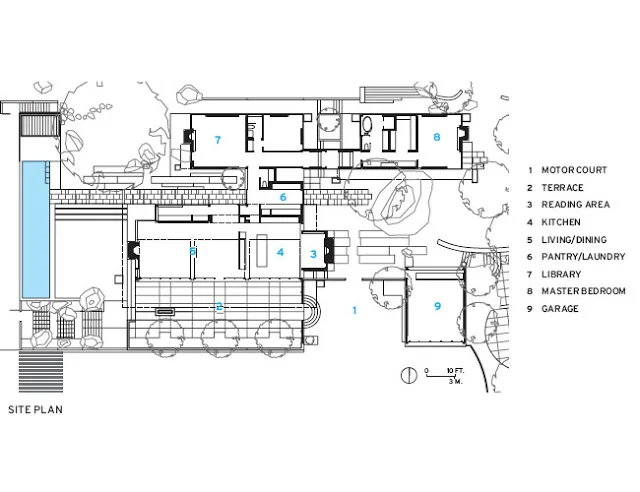
The beauty of this house once again lies in the design of the indoors with the outdoors. The living room once again is designed to completely open to the outside, this time with 20-foot wide steel and glass doors that open mechanically and fit under the roof when opened. In the floorplan, notice how the architect has designed the outdoor terrace to be bigger than the indoor living room clearly indicating the importance of outdoor living.

The living room completely open to the outdoor through mechanically pivoted doors

The structure is designed completely in glass and steel with the aim to open it to the outdoors

We like the way the structural metal is left exposed. We enjoy the honesty of material and clarity in design

Berlin: A Lesson in History and Free Spirit

We recently traveled through Germany thoroughly enjoying the German beer, extensive history, and their love for art and contemporary architecture. Cosmopolitan, quirky and free Berlin stood out as the star in our travels.

What makes Berlin more interesting than other European or north American city is it's relative newness and it's free spirit. After a long and painful history that culminated with the second world war and then continued with the cold war, the City of Berlin as we know today restarted rebuilding it's legacy in 1990. That is what I mean by the newness. As the city decided to move on, it began by accepting its history and then marching forward with a liberated spirit. The present spirit of Berlin seems more free as the freedom was hard to come by.

Berlin is a big city. It takes a while to get your arms around it. It is teaming with life but still feels empty when one is used to New York, Delhi or Mumbai. Berlin is also a city of neighborhoods that are at various stages of gentrification. The more interesting neighborhoods are the nearly gentrified Prenzlauer Berg and still gentrifying Kruezberg and Friedrichshain.

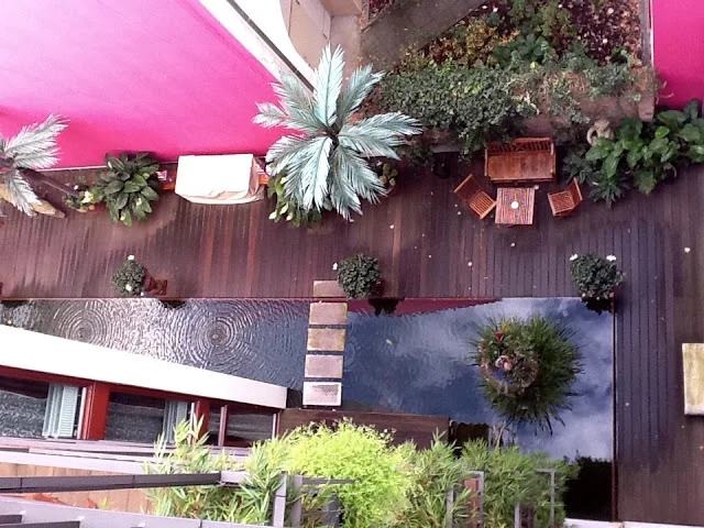
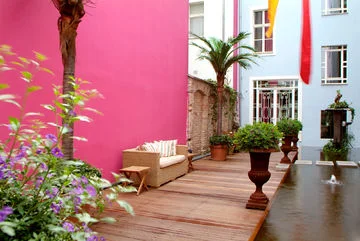
Bali inspired courtyard at Boutique Hotel Ackselhaus housed in a historic building in Prenzlauer Berg, Berlin

We stayed at 

Ackselhaus and Blue Home

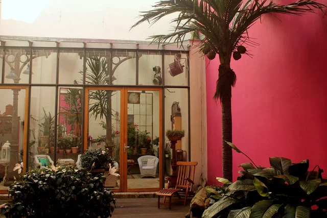
, a boutique hotel located in two historic buildings in Prenzlauer Berg. Both buildings have been lovingly restored by the owners. But the real treat is to see how contemporary elements have been woven into the historic character of the buildings. One of the buildings has a notable tropical Balinese resort feel. It was refreshing to see seemingly disparate elements of design (Historic European, Contemporary, Tropical) all put together in a unique style statement.

Sunroom in the courtyard with salvaged iron columns from old train station in Berlin and a Balinese daybed

Now let us talk about my favorite part, the contemporary architecture that dots the city of Berlin. One can name any master architect and they have built in Berlin. The history of the city along with its relative newness has allowed architects to build beyond barriers. The result is a refreshing collection of contemporary architecture that spans museums, residential and commercial buildings.

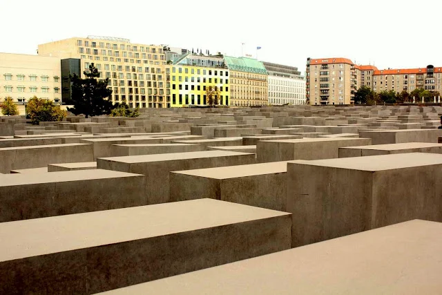
Eisenman's Holocaust Museum in Berlin with Gehry's DZ Bank building in the background

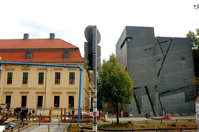
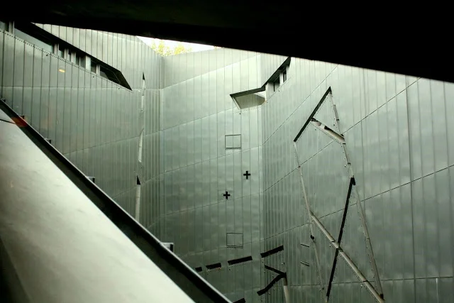
The old and the new building at the Jewish Museum in Berlin. Later designed by Daniel Lebiskind

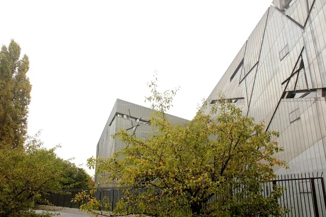
The best of them all was without doubt is the Jewish Museum building by Master-Architect Daniel Lebiskiend (DL). DL was also the very deserving winning architect for the Freedom Tower at Ground Zero in New York. His creation at Ground Zero would have been a piece of art, an apt addition to the New York skyline but sadly the present design and resulting stump of a building is a political compromise that does nothing to advance design and architecture.

The exterior of the Jewish Museum building is clad in Zinc that is oxidizing to give it a blueish color

But I diverge, coming back to the Jewish Museum building in Berlin. I will take a pause to say this - according to me 

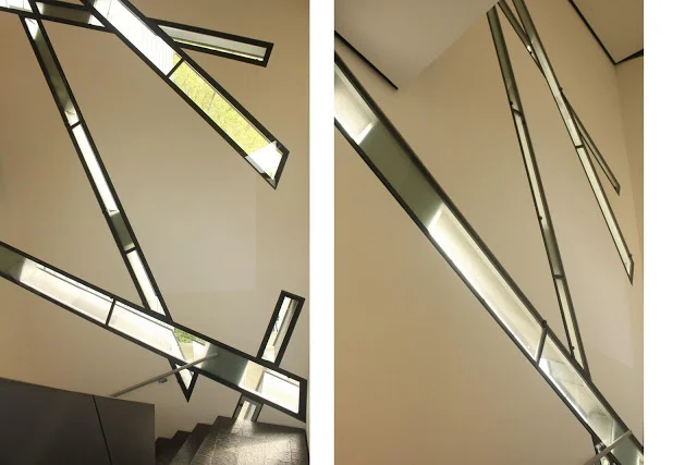
the Jewish Museum is the best building in the world today

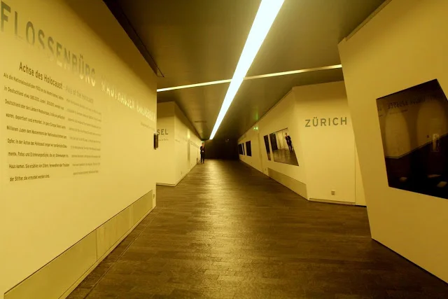
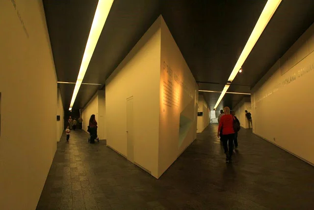
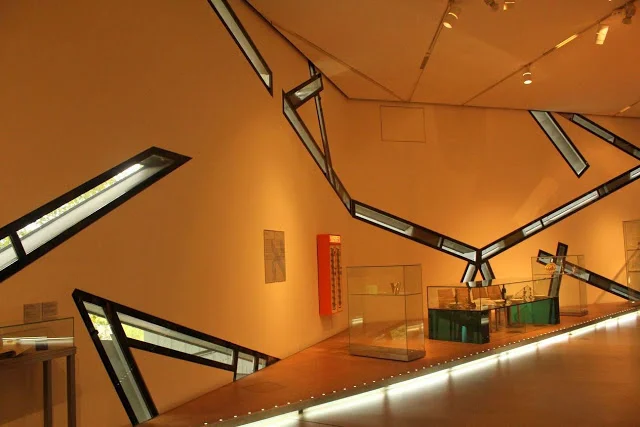
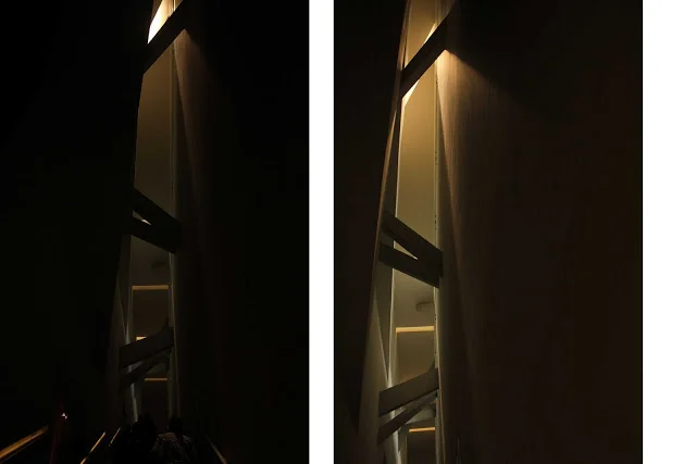
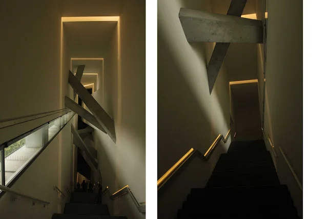
 ! This is a big distinction and the reason I say this is two-fold; one is the ability that the built space has to evoke emotional reactions and second is the limitless extent of design thought and detail that has gone into this building. My reaction to this building is contrary to my proponance for minimalism and the idea of keeping design simple and lucid. The Jewish Museum is a severely complex building but the beauty of it is that everywhere you look one is presented with perfect example of design work where complex geometries, materials and play of light are prefectly composed into multi-dimensional multiple frames of architectural space. The typical problem with complexity in design is that buidlings can very easily look over-designed and it is mostly difficult to justify the complexity. Mostly complexity in design makes it difficult for various elements to come together and the core concept or design driver is lost. None of the above are a problem at the Jewish Museum. DL has built a building that is complex yet true to its central design thought, and the building inside and outside leaves a lasting impact on the viewer/ inhabitant. The building has the ability to evoke strong emotional reactions that are linked to the design concepts weaved into the building.

Words cannot do justice to the building, neither can images, but here are some to offer a taste of what the magnificent piece of architecture has to offer.

Exhibition galleries at lower level where three conceptual axis intersect

Exhibition galleries at lower level where three conceptual axis intersect

Windows seen from inside the gallery space

Window detail

Staircase ceiling detail

Core vertical circulation that connects the gallery space at 3 levels

Buildings that twist, bend and scream perfection

OMG! How does one build like this... 

The pictures above show the twisted, bent and warped facades of the stainless steel clad Frank Gehry's Beekman Towers, Frank Gehry's IAC Headquarters, Jean Nouvel's 100 11th Ave, and Thom Mayne's new Academic Building at Cooper Union, all in New York.

The question I ask is not how one thinks of these buildings, dreams them up at night or during a drunken creative breakthrough. The key question for me is how does one take these magnificent forms from paper to reality. Maybe I am jaded. But the quest to understand design to execution has dictated my professional journey, where I started as an architect who believed that design was supreme and then went on to studying and practicing as a city planner and real estate professional in an attempt to unravel the processes that translate design dreams to reality. I still think that design is supreme but really it can be so much more if implemented correctly on budget and on time. My architect friends may hate me for saying this but in a way I am their biggest proponent. I think that architects are supremely talented, way ahead of the times, and therefore I believe that their creations need to be built so the world can be a better place.

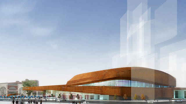
Renderings showing the proposed Barclays Center in Brooklyn, New York

So going back to the question of 'How does one build like this?'. The above rendering shows the new Barclays Center under construction in Brooklyn, New York. The project is being built by developer Forest City Ratner as part of the very controversial Atlantic Yards project in Brooklyn, New York. Interestingly, I had the opportunity to work with their parent company Forest City Enterprises in 2008-09 on mill redevelopment projects as part of the development team. Forest City Ratner is also the developer for the stately Beekman Towers (image on top).

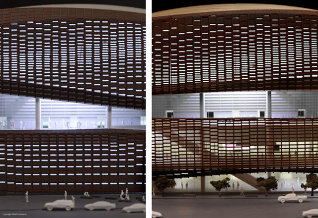
Detail of the facade at Barclays Center made with pre-weathered metal lattice

Last week, I attended a talk by Jonathan Mallie from SHoP Architects and Construction who are the architects on the job and are facilitating the construction.

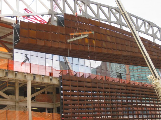
The building's external form is designed with concentric helical bands that are superimposed on each other. To mask this snaking form, the building will be skinned with a weathering steel latticework system. The lattice system goes over a glass curtain wall. Before installation, the metal lattice panels are pre-weathered to obtain a patina that makes them look older (weathered) in a design attempt to resemble the historic brownstones of Brooklyn.

And here is the kicker in the whole story, the proposed skin is comprised of 12,000 uniquely designed mega panels; each unique in size, shape, and individual pattern of folds and bends. Yes, I know....CRAZY ! Imagine implementing something like this. Imagine manufacturing each panel individually, imagine producing 12,000 individual drawings for each panel and then imagine coordinating the whole process, managing delivery and installation....

Photo of the lattice panels being installed on-site at Barclays Center

How does one go about a challenge like this? In this case, SHoP Architects have a sister company called SHoP Construction who played the key role of coordinating all design and construction efforts. They employed technology and created a Catia based 3-dimensional model that integrated all the building components with a back end database that recorded the details of each component (so size, individual design and special characteristics). As an example of attention to detail, SHoP actually analyzed the optimum size of panels and optimum stacking for road transportation (panels are being manufactured in Indianapolis and the project is in New York, 700 miles away from each other). After this exercise, they actually modified the design of the lattice panels to ensure efficient transportation. This is also an example of how an entity like ShoP Construction was critical to project implementation that allowed for communication between designers, manufacturers and contractors, who in spite of being in the same industry generally speak different languages, meaning have very different roles, scope of work and motivations.

The centralized model and database was also used to generate the 12,000 unique drawings for individual panels. And then they did another cool thing, implemented another idea that has probably never been done before.. Each panel was assigned and identified by a bar code. So each drawing had a bar code that was repeated to tag the panel once manufactured, was scanned when the panel was put on the truck to be transported to site, again scanned when it reached site and then again once it was installed. Taking it all the way, this electronic information was then made available real-time through a project website that kept all team members from the owner, architect, manufacturer, contractor up to date on where each of the 12,000 panels were at any given point in time. All this is so cool, that I just can't type fast enough to tell you all about it... just thinking about it makes me jittery with excitement...Oh and of course, the electronic tracking system was also available to the project team as an IPhone application... 

Learning about these wonderful stimulating innovations in design and implementation left me wanting more...The mantra to successful project implementation is seamless communication between all parties. With technology this communication can improve by leaps and bounds. For our project, we rely on digital photographs, skype calls and in-person meetings with all project leaders. It works well for now, but I will end the post hoping that in the future we will endevour to design and build more complex buildings and embrace cutting edge technology to do the same.

Read more about,

The weathering process for lattice panels

 at Barclays Center

Video of construction sequencing at Barclays Center

Read New York Times architectural review of,

Frank Gehry's Beekman Towers

Frank Gehry's IAC Headquarters

Jean Nouvel's 100 11th Ave

Morphosis's Cooper Union New Academic Building