A Blog
with a curation of our design ideas and inspiration for houses in Goa, contemporary art and architecture.
Archive
- A Grounded Palette 12
- Architecture 85
- Art 19
- Bangalore 1
- Conservation 5
- Design 39
- Designing a House in Goa 16
- Ecological Design 20
- Environment 38
- Geoffrey Bawa/Bijoy Jain 6
- Goa Ecology 7
- House for Sale in Goa 20
- Interiors 17
- Landscape 3
- Landscape Design 9
- Life 23
- Lifestyle 10
- Living in Goa 33
- Mentoring 4
- Moving to Goa 24
- Navovado Project Update 4
- Nivim Project Update 33
- Press 11
- Resort-style Lifestyle 14
- Sustainable Architecture 20
- Sustainable Design 18
- Toybox 1
- Wellness 5
- reed bed 1
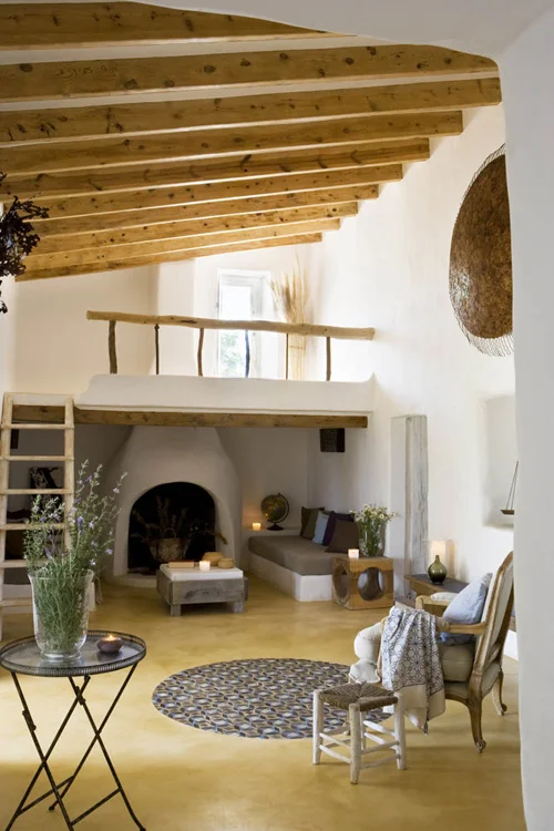
I am writing this post as an addendum to the previous post on 'dreaming up a life lived outdoors'. The following are a collection of rooms that have been an inspiration in the design of indoor-outdoor spaces in our house in Goa.
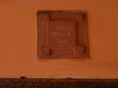
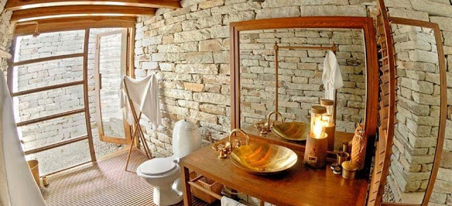
The first picture is of the famous 'loo with a view' at the Neemrana Fort Palace. Some 15 years back, I had interned with an architect on a design job at the Neemrana Fort Palace. Along with the gorgeousness of the palace hotel, the super attention to every detail in design, construction and finishes, the 'loo with the view' left a deep impression on my mind. It represents the fun in architecture and represents the luxury of living away from the swarming crowds and making everyday moments grander, exciting, liberating and inspiring.
Another space that has been a recent inspiration is
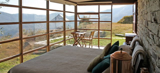
, a beautiful hotel nestled in the Himalayas. The hotel is designed by one of my favorite contemporary Indian architect
. I love the way he has succeeded in using local materials in a very contemporary design and blurring the boundaries between indoors and outdoors.
Two images below are from the
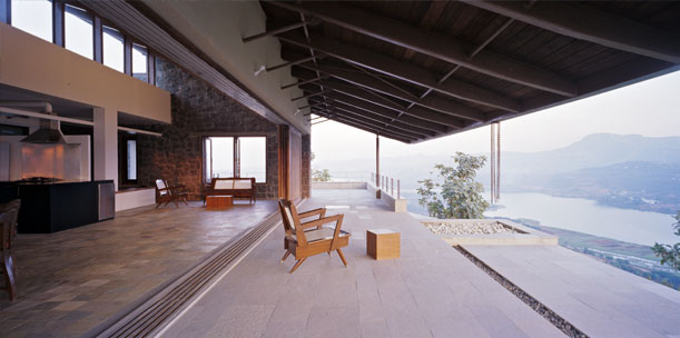
near Pune designed by Opolis Architects. This is a truly inspiring space. Notice the size and proportions of the interior space and how it flows into the outdoors through a completely movable wall. Also, note the windows in the top that keep the space filled with light making it look big and airy.
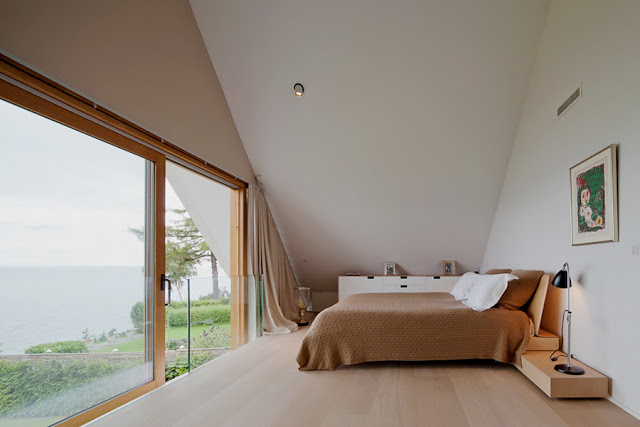
Then there is the following house in Denmark that was recently
. I can't get enough of the uncluttered large spaces with clean lines, minimal furniture and color. There is nothing to distract you from the most important aesthetic of bringing the outdoors into the indoors. Notice the use of textured stone in the bathroom where one would walk bare feet, a little detail that will probably go unnoticed but adds so much to the experience of living in the house.
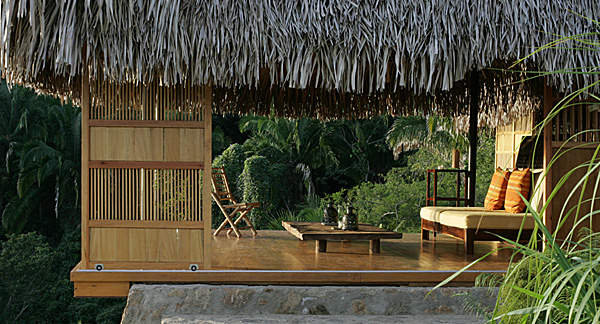
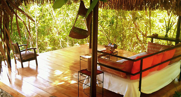
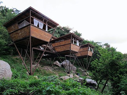
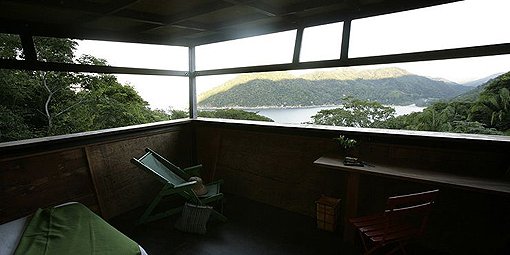
These last set of pictures are from a heavenly resort called
. They have a bunch of houses. The design for all of them prioritizes reconnecting with nature above all else. My favorite is the
. See pictures below.
I firmly believe that country homes is a unique architectural genre and building them to look like five-star hotels is the easiest way out. Country homes should celebrate their location and be a part of the surrounding countryside by using local materials, local traditional construction techniques and rustic interiors/ furniture.
Another key element for cozy country homes is their relationship to the outside. In the most enjoyed homes in the country, the outdoor spaces are as important if not more than indoor spaces. After all, the reason to be out in the country is to reconnect with nature, to de-stress and inspire, all in an effort to enrich the patron's quality of lives. Outdoor spaces are also important to entertain while spreading the joy to family and friends.
Country homes provide the perfect backdrop to indulge in the simple rustic country life with its treasures of exotic fruits, fresh farm produce, tropical drinks, and traditional robust recipes.
Why build a house in the country if at best it feels just like an expensive apartment in the chaotic city? when there is the opportunity to build and enjoy something like this ...
Postcard from High Line exhibition at MoMA that I have saved as a design inspiration since 2005
The High Line Phase 2 opened in June, a few weeks after I flew back to Goa. It makes me sad to not be there and experience it for myself.
I have been tracking the High Line project since 2003 when there was a design competition to transform an abandoned freight railway line in Manhattan into a public park system. The competition was won by Diller Scofidio + Renfro.
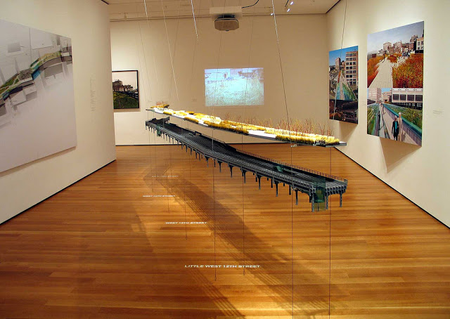
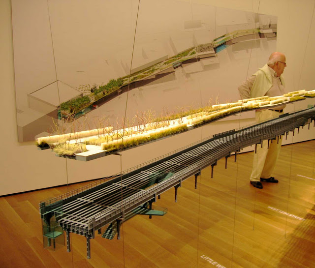
In 2005, there was an exhibition at MoMA with a large scale detailed model of the highline that was suspended within the gallery and hung in mid-air. The design and exhibition was so very inspiring for the young architect/ planner in me. I marvelled at the way the architects had proposed a design that preserved the historic legacy of the space, while introducing a new park system that balanced planted green areas along with paved usable spaces.
High Line exhibition at MoMA
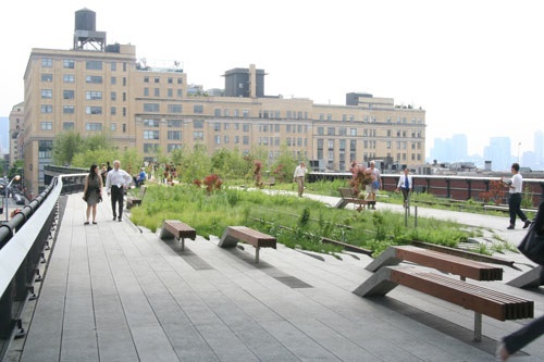
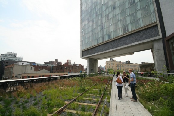
I love the contemporary use of material along with new age designs for every element including the precast concrete finger like paving that weaves into the planting beds, the floating street furniture, and special areas for seating and congregation that celebrated the city by framing views and entrances. The relationship to surroundings is further heightened when buildings bridge over the High Line (few older industrial buildings and of course the new Standard Hotel). The entire project represents the brilliance of the architects and embodies their passion for the city, contemporary design and building materials.
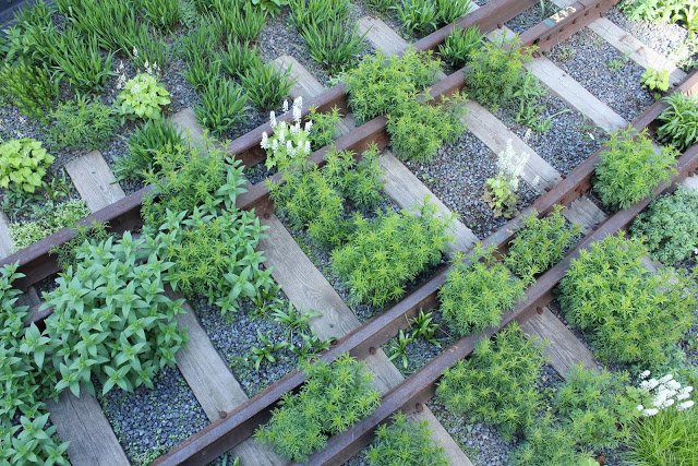
The original tracks that were carefully replaced back in their original position after the restoration work
The finger-line pre-cast concrete paving that weaves into the green spaces. Planting beds are planted with native species of grasses and wildflowers so they require less maintenance and water
Floating landscape furniture in new age contemporary design
Amphitheater that looks onto the city streets and celebrates the chaos
Our takeaways from the High Line for our project in Goa are as follows:
- Need for a comprehensive understanding of the site and the project's relevance to its surroundings. Preservation of this understanding and relationship in the proposed design.
- Excellence in design and attention to detail with a passion for perfection
- Integration of contemporary design while preserving the historic legacy of the place
- Fearless new and innovative use of material
- Use of native species of plants to propose a landscape that requires little maintenance, water and other resources
Hotel Standard built over the High Line
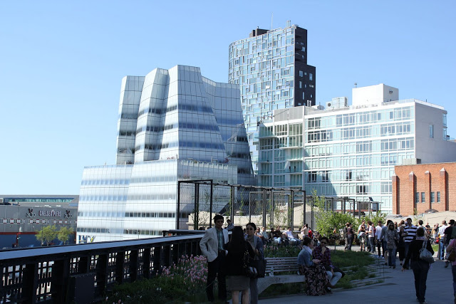
My favorite view from the High Line framing a Gehry building and a Jean Nouvel building.
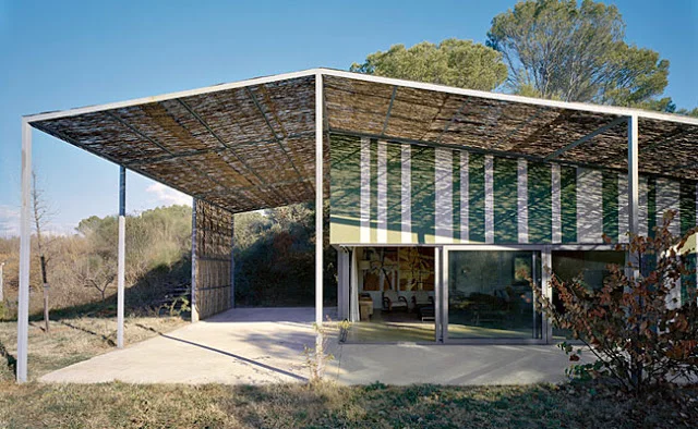
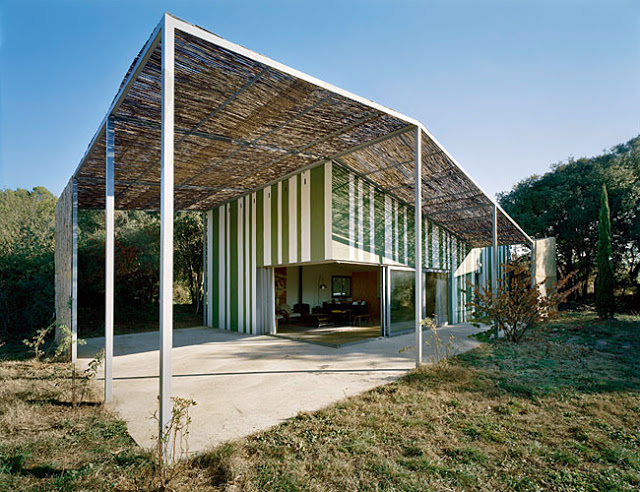
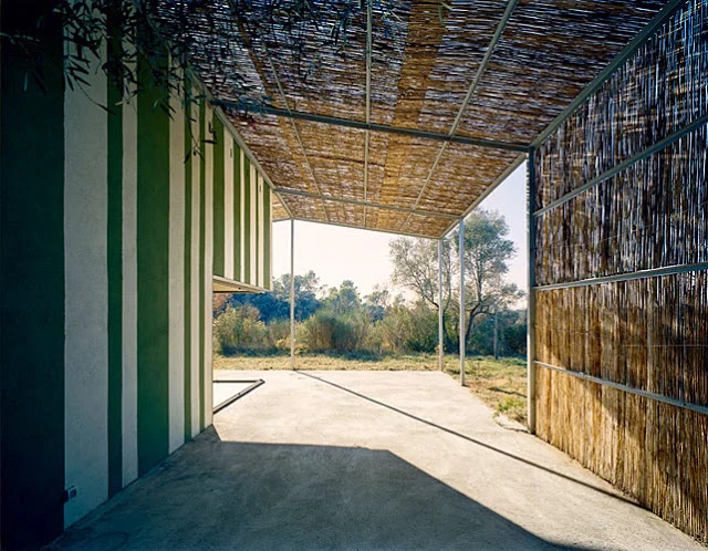
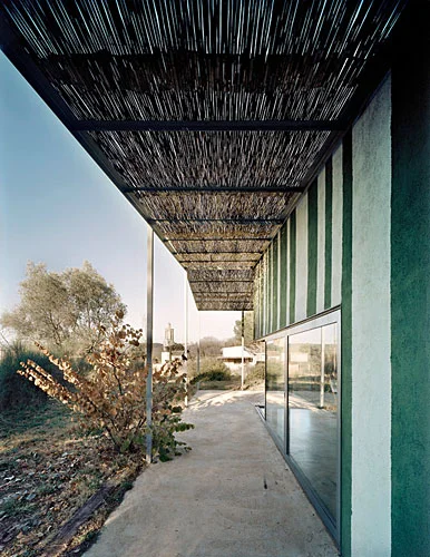
House in Gauses by Anna and Eugeni Bach
A small house in a village in Spain. A featured house in
.
The architects have employed an open plan while building the structure using traditional construction methods.
Several design themes resonate with our design concept,
-
-
The architects have used load bearing walls to reduce use of structural concrete and steel
-
-
Designed the house so that the corner of the living room opens up to make it a part of the porch and garden while providing views to the mountains beyond
-
-
Used local materials and techniques, like the woven cane for the roof over porch wrapping the house along with contemporary materials like steel frame and aluminium windows.
This is a small house with a very contemporary design that fits right into the surrounding landscape without needing to copy traditional house typologies or making a strong architectural statement. I would identify this as an example of responsive contemporary architecture.
According to an architect friend of mine, 'architecture is nothing but the play of light on surfaces'. This house scores high on that aspect with the beautiful light cane roof creating dynamic patterns on light and shade on house walls that are painted with bright green and white stripes. Everyone, please note that the cane roof needs to be replaced every two years. This material is similar to the way Goans create woven screens from coconut leaves.


